About Project
The brand name comes from a sanskrit word representing the identity with a smooth calm aura. The brand comes from years of experience and knowledge to build the spirituality for the customers.
- Client:
- Svaraa
- Sector:
- Health and wellness
- Service:
- Visual Identity


The Brief
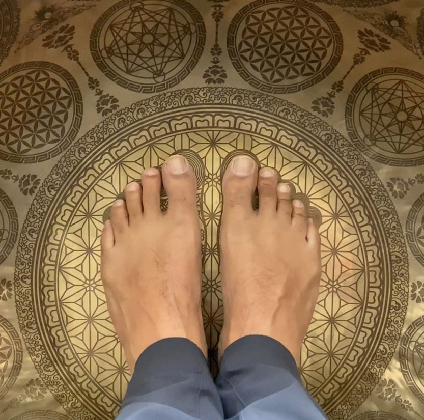
Svaraa comes from the Sanskrit word svar. For us, it means to feel and listen to the sound of breath while you use svaraa products. Listen to the voice of the inner self and immerse in a spiritual experience.
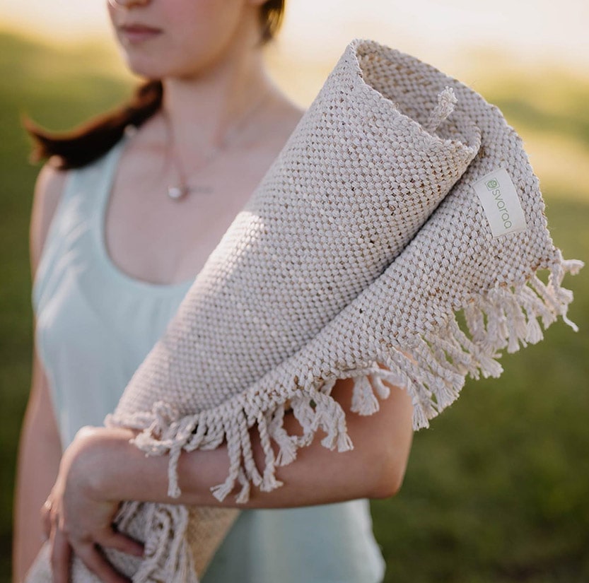
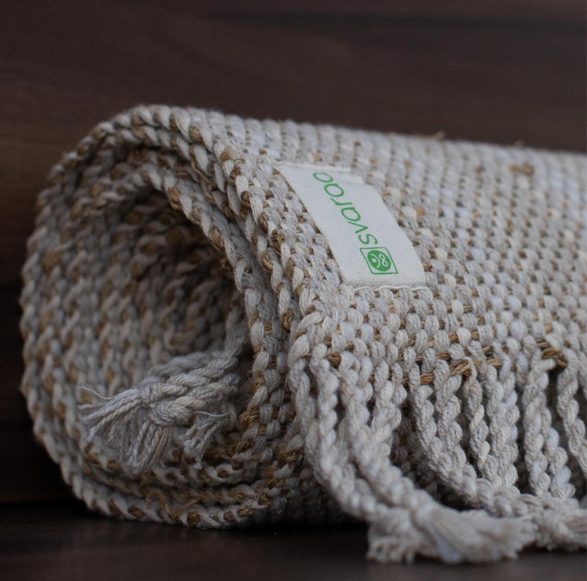
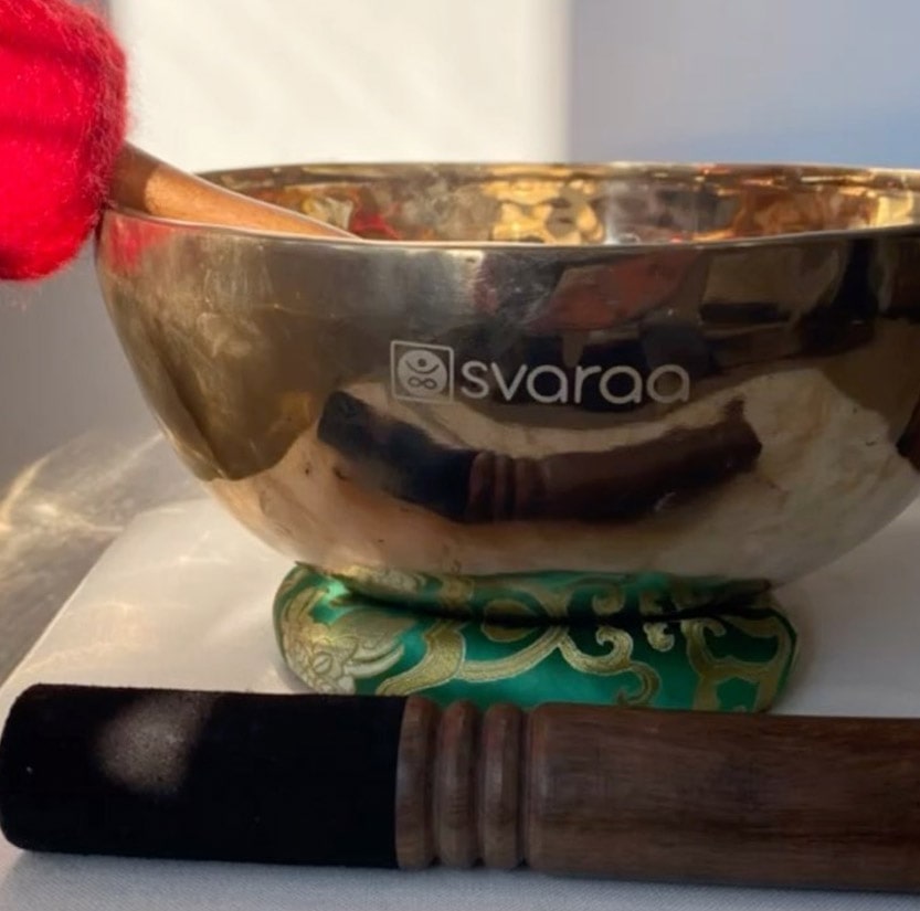
Should resonate with the story and vision behind the foundation of the company. To bring people to one platform where all their meditation and yoga needs are taken care of. The products will be such an experience where they get close to themselves and listen to their inner self through the experiences provided by our products.
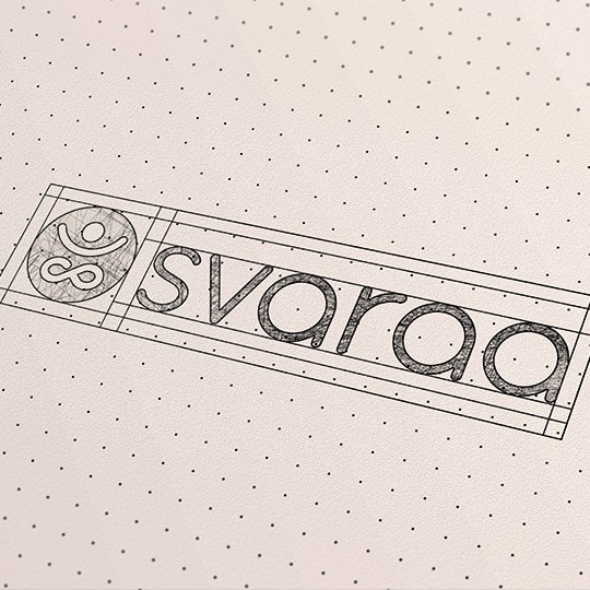
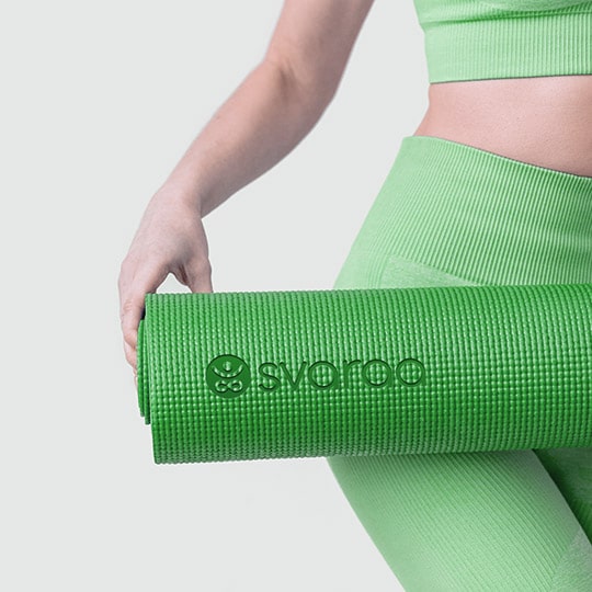
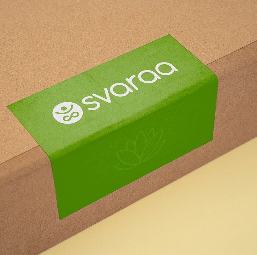
Our Idea
In this particular option I have used a simple, elegant yet firm typeface that has a round character that showcases smoothness and friendliness. A small icon is added which is a human form, the hands upwards which also emphasises wellness and positivity and also looks like a smiley. The legs of the form look like an infinity sign which signifies limitlessness or eternity. the colour which is used is pastel green which gives an impression of health and healing.