About Project
The brand name Sattvic Culture derives its identity from the Sanskrit word ‘Sattvic’ which refers to pure, clean, and strong energy. All the sattvic foods are destined to help the customers attain the goal of a balanced and harmonious life.
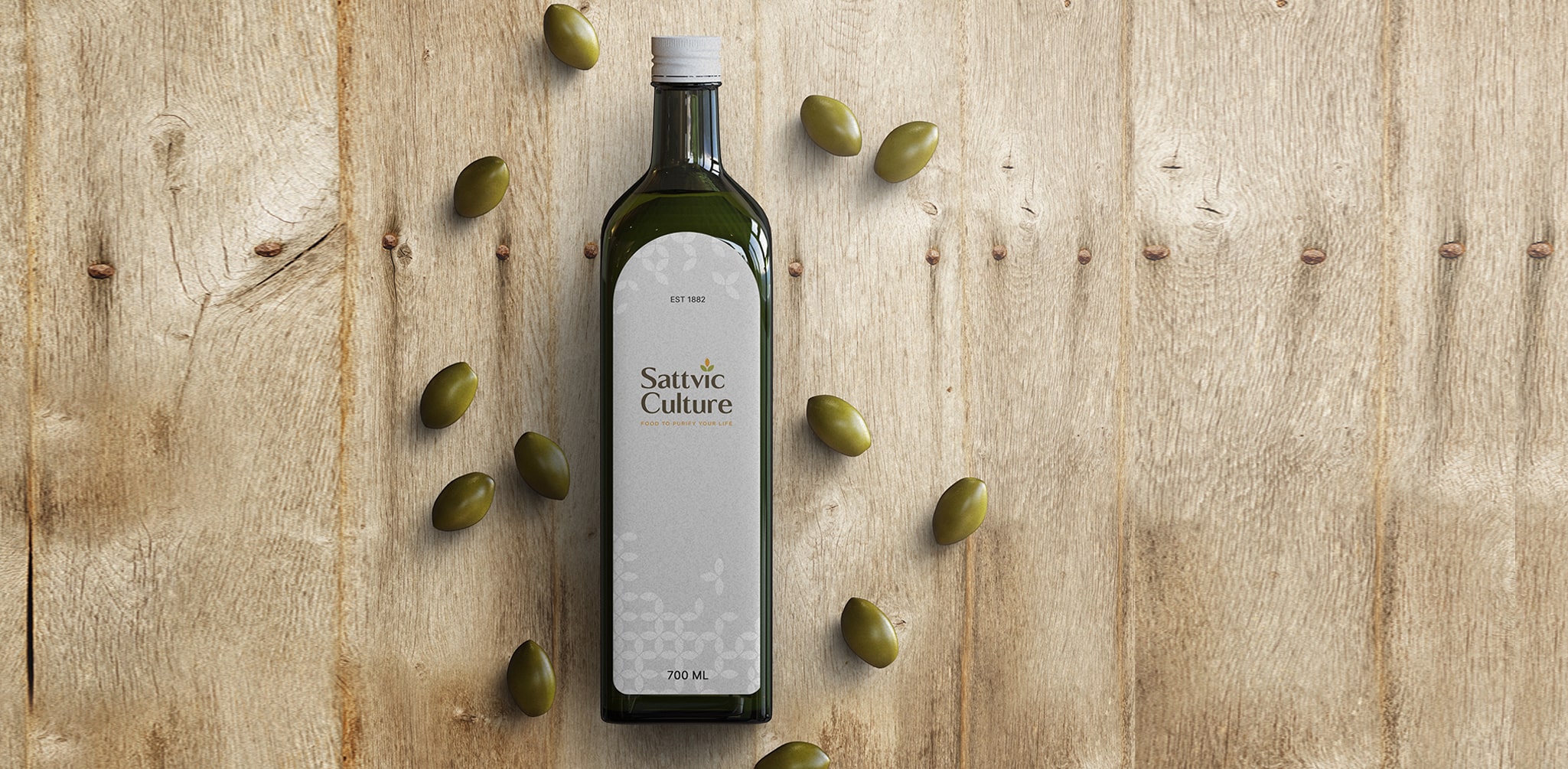
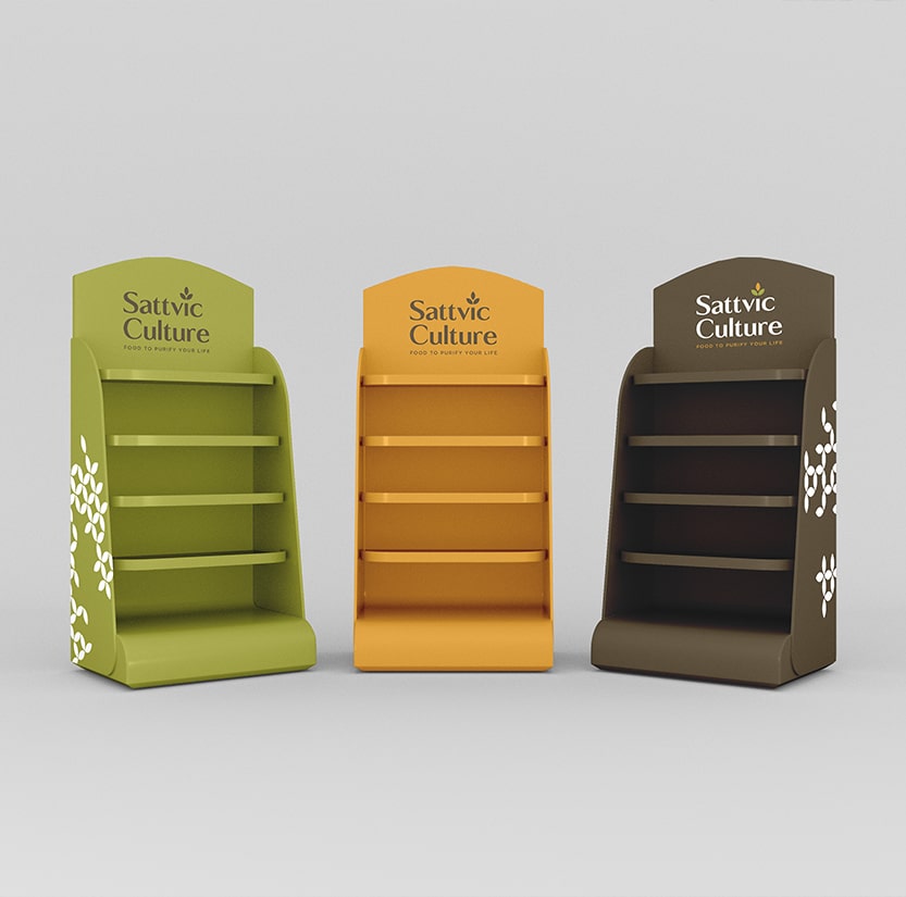
The design is meant to deliver purity, calmness, and a soothing aura of Sattvic Culture products. All in all, the logo is meant to be about the fact that the brand has emerged from its roots and its fruits are meant for the customers.
- Client:
- Sattvic Culture
- Sector:
- Health and Nutrition
- Service:
- Visual Identity

The Brief
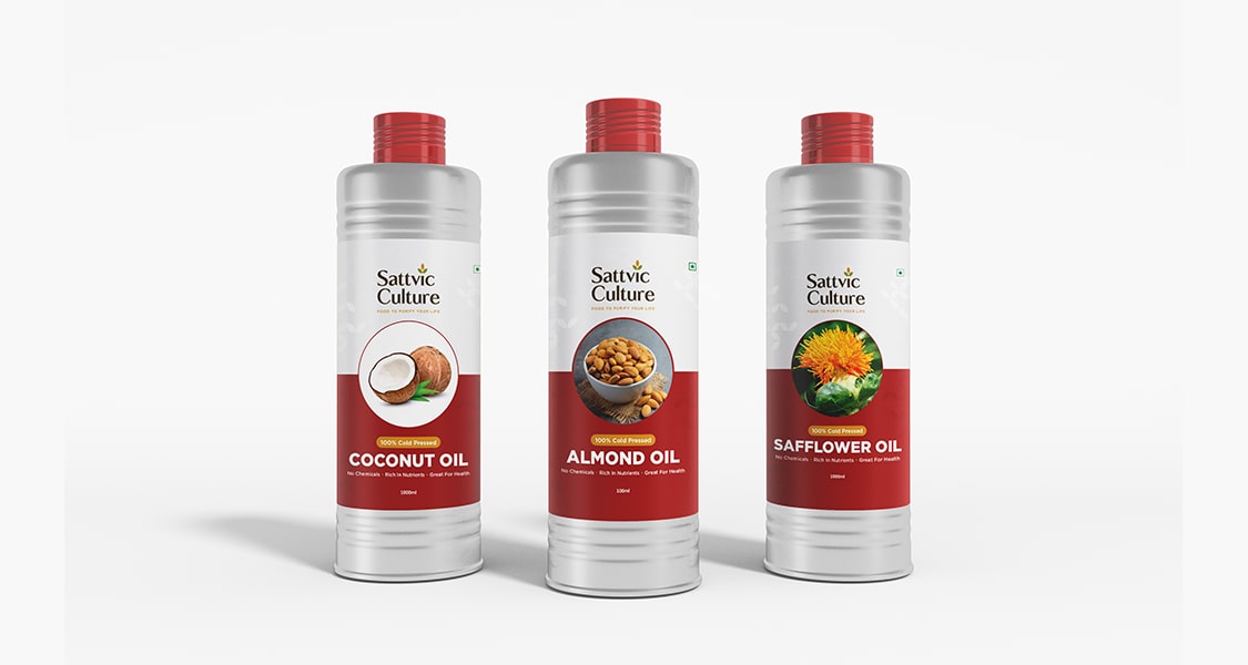
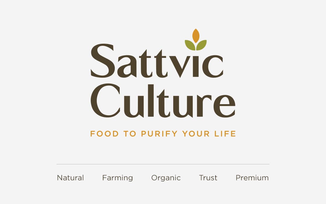
The essence of the brand lies in absolutely pure and organic foods. The approach is to create a logo that talks about organic and farm-based products. The baseline of all the products is 0% adulteration and 100% purity. Not to mention, all the products are manufactured using traditional production methods and the logo is meant to have its reflection. A chemical-free and organic way of production offers unparalleled health benefits and a rich taste.
Our Idea
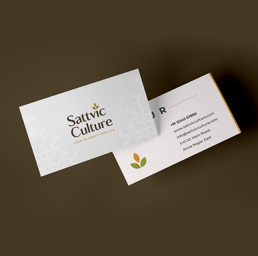
‘First impression is the last impression this sole belief led us to create a logo that carries the imprints of organic foods. Taking a closer look at the logo, one will realize that the ‘i’ of Sattvic Culture has a leaf on top of it. This leaf is a symbol of our agricultural practices that churn out all the pure and healthy products.
