About Project
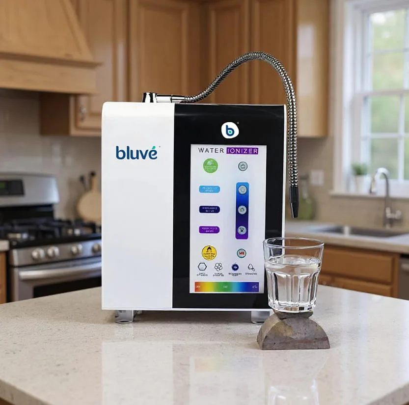
Bluvé is a modern Hydrogen Alkaline Water and wellness brand focused on smarter hydration and innovative water solutions. The brand needed a distinctive identity that could communicate wellness, innovation and a premium approach to hydration while creating a fresh and recognisable presence in the category.
As part of the rebranding journey, the identity evolved from its earlier name, Oasis, into Bluvé, creating a more contemporary brand expression aligned with its vision for smarter hydration and healthier living.
- Client:
- Bluvé
- Sector:
- Appliance Manufacturing
- Service:
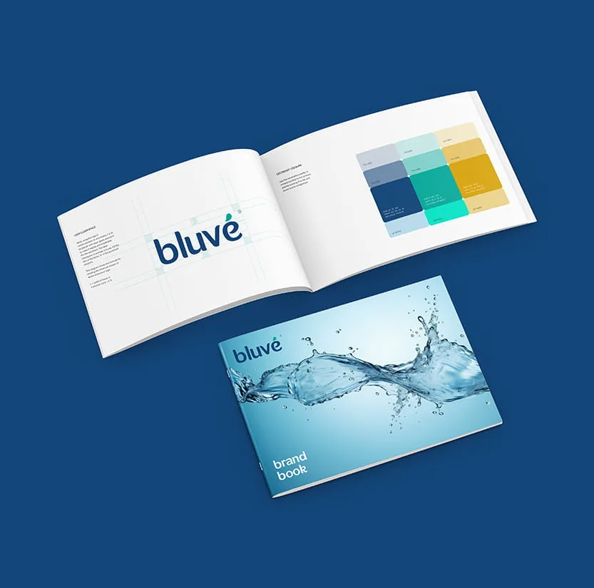
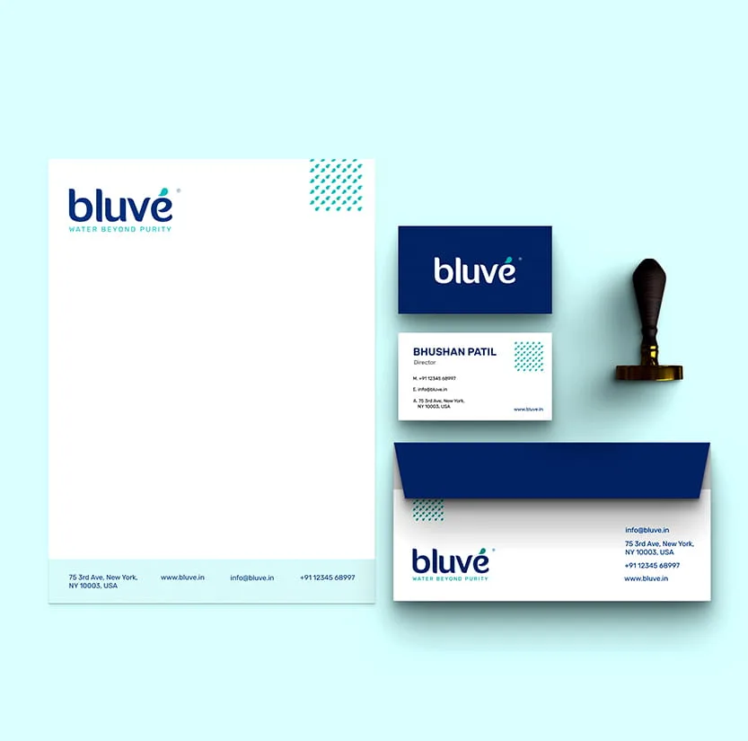
- Brand Name, Identity & Brand Book

The Brief
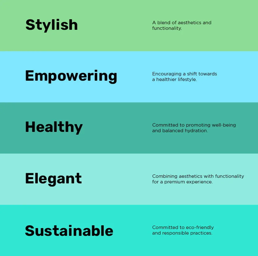
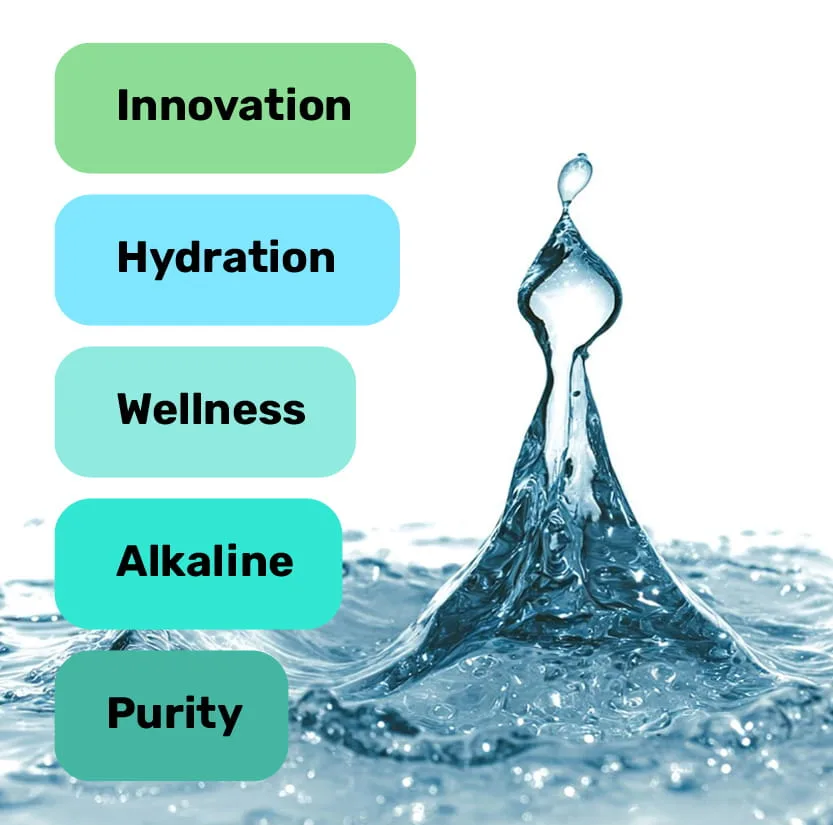
Bluvé wanted to build a visual identity that represented its focus on purity, hydration and wellness while standing apart in the water purification category. The identity needed to feel stylish, approachable and premium, while reflecting the natural essence of water and Bluvé’s innovative approach to alkaline hydration.
Our Idea
The identity for Bluvé was created as part of a shift from the brand’s earlier name, Oasis, which did not fully reflect the desired modern, premium and innovative positioning in the alkaline water and wellness space. The new name Bluvé was developed to create a more distinctive and contemporary brand presence centred around purity, hydration and wellness.
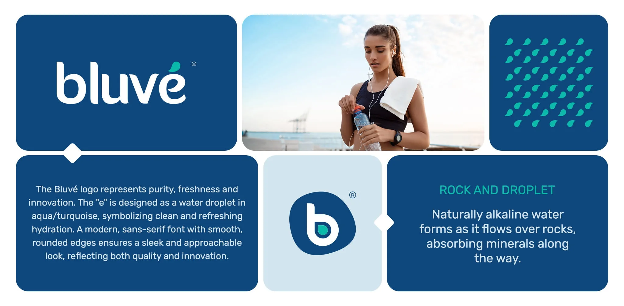
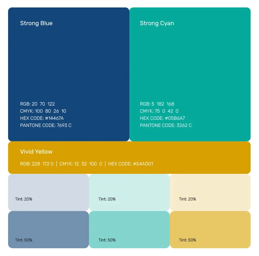
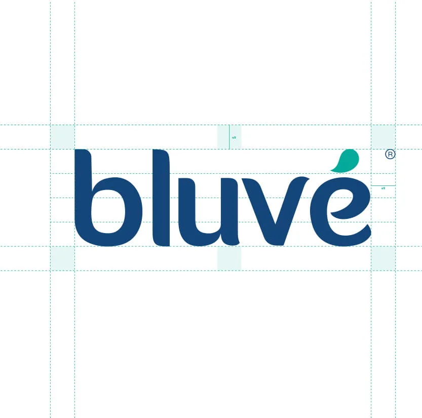
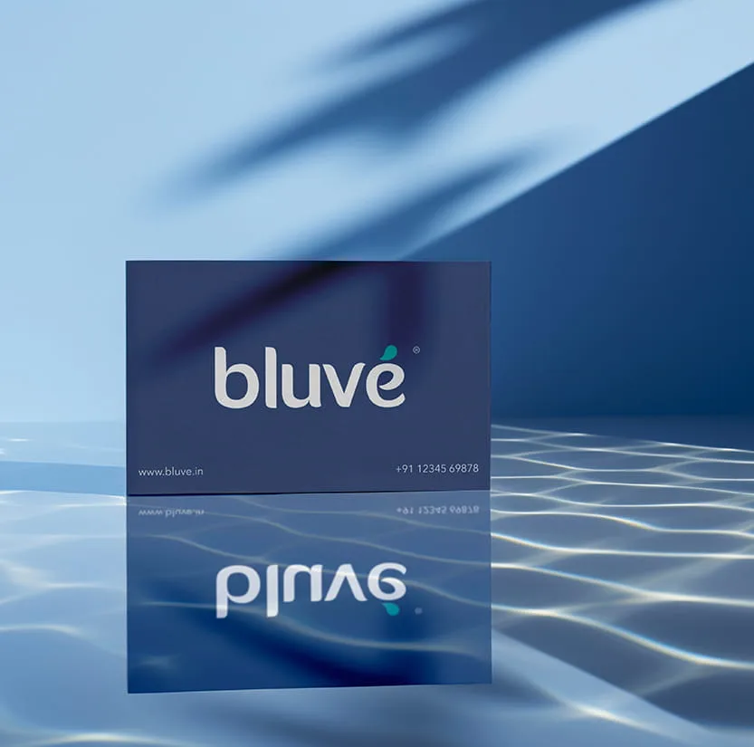
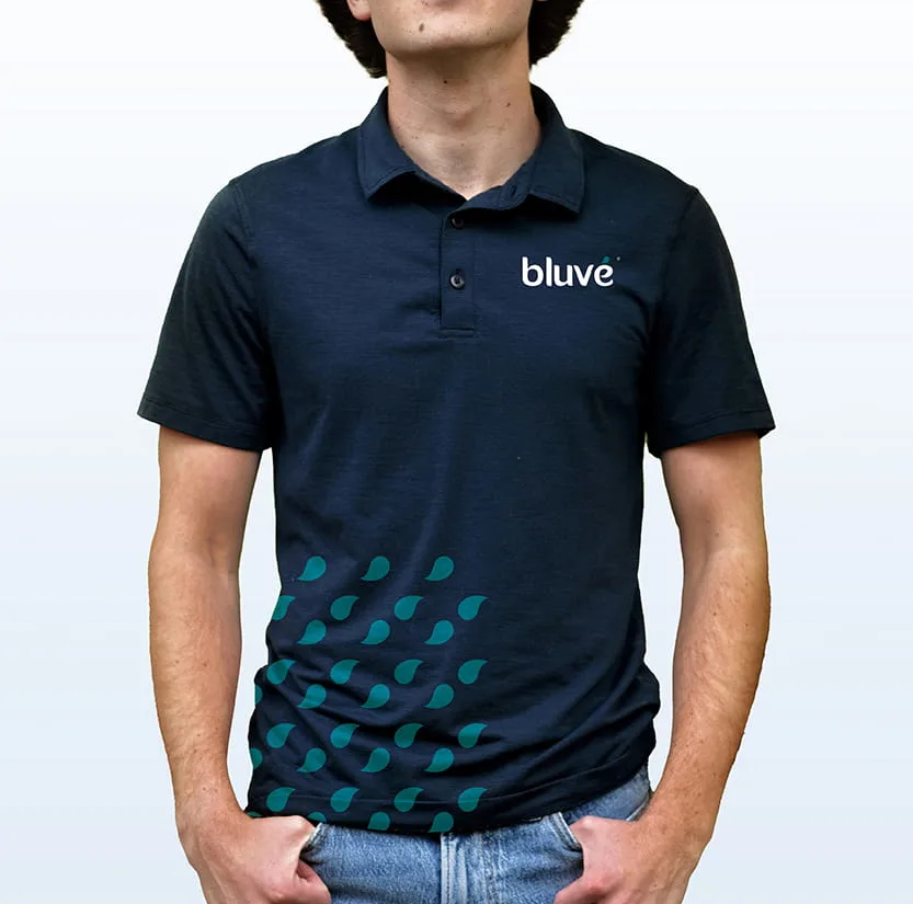
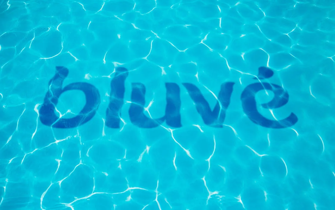
The visual identity draws inspiration from the natural qualities of water. The stylised “e” in the wordmark is inspired by a water droplet, representing purity, freshness and the continuous flow of water. The clean, fluid forms give the brand a modern and approachable personality, while the blue and cyan palette reinforces trust, freshness and clean hydration.
The Logomark
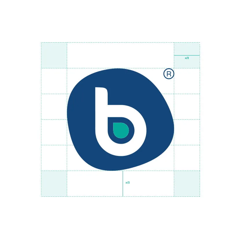
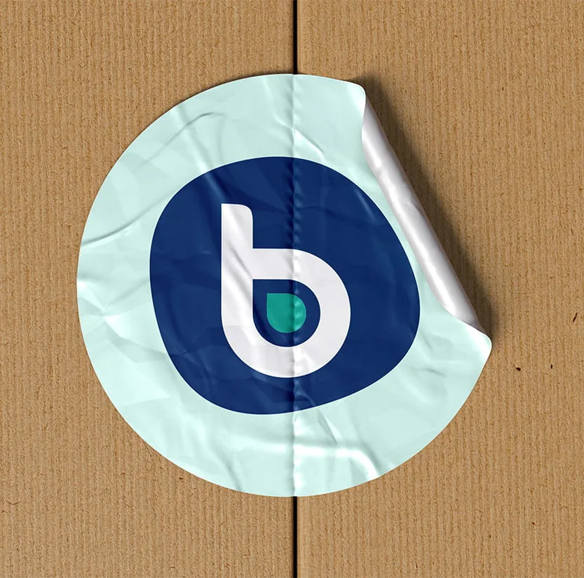
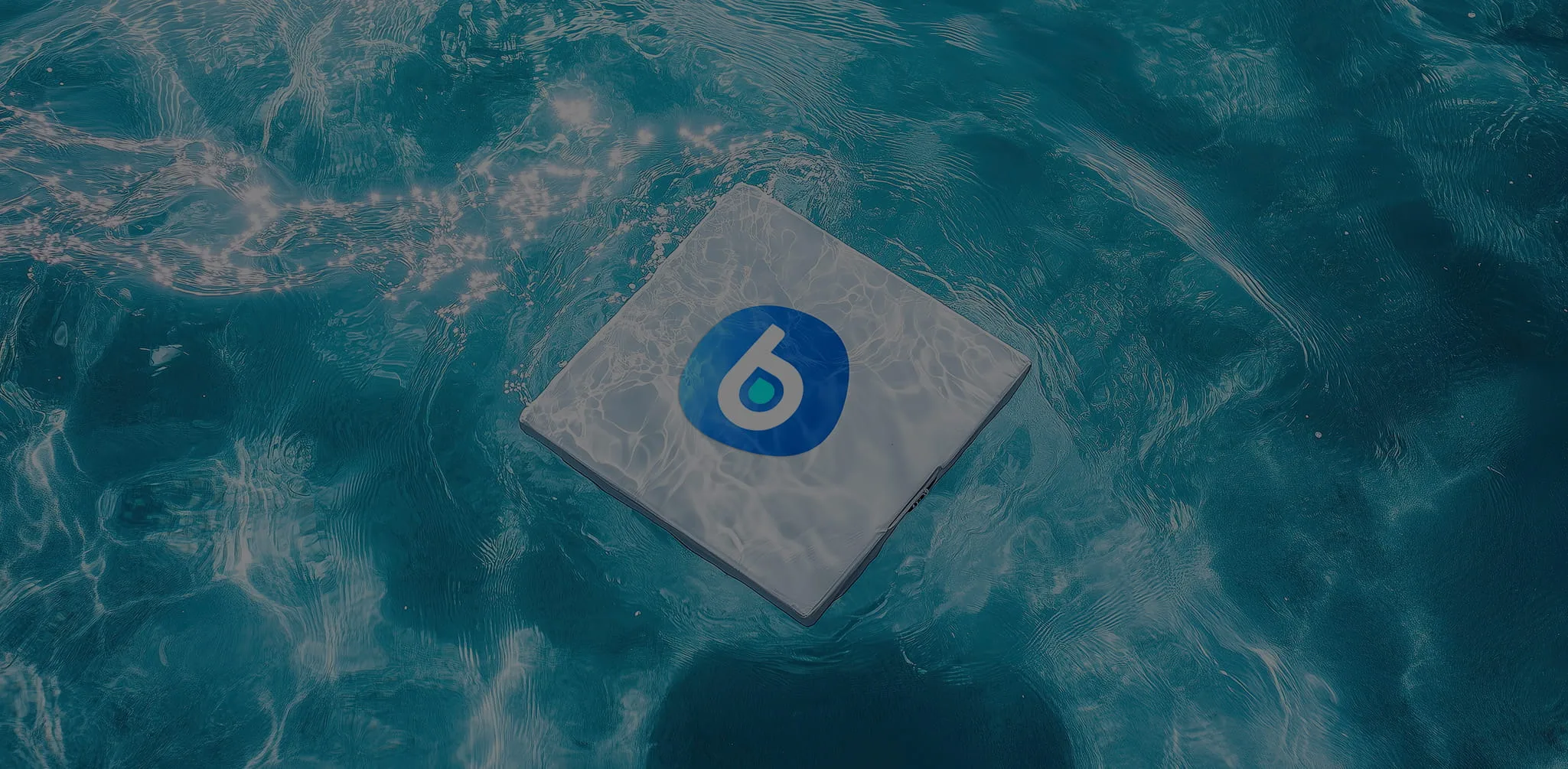
The “e” logomark is inspired by the natural relationship between rock and water. The concept draws from how naturally alkaline water forms as it flows over rocks, absorbing minerals along the way. The rock represents the natural source of minerals, while the droplet represents clean, refreshing hydration. Together, they communicate the essence of alkaline water, purity and natural wellness.
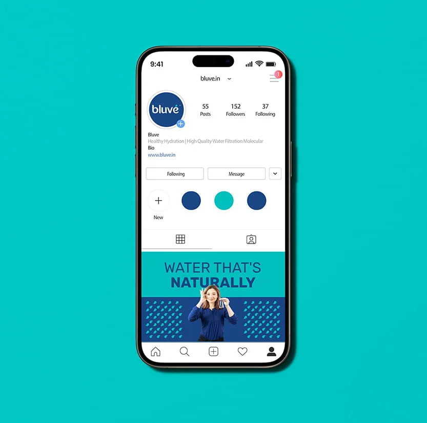
The fluid form of the “e” creates a distinctive and recognisable symbol for Bluvé, while its simplified design allows it to work effectively across app icons, favicons, social media profiles, product applications and other small-space brand touchpoints.
Brand Expression
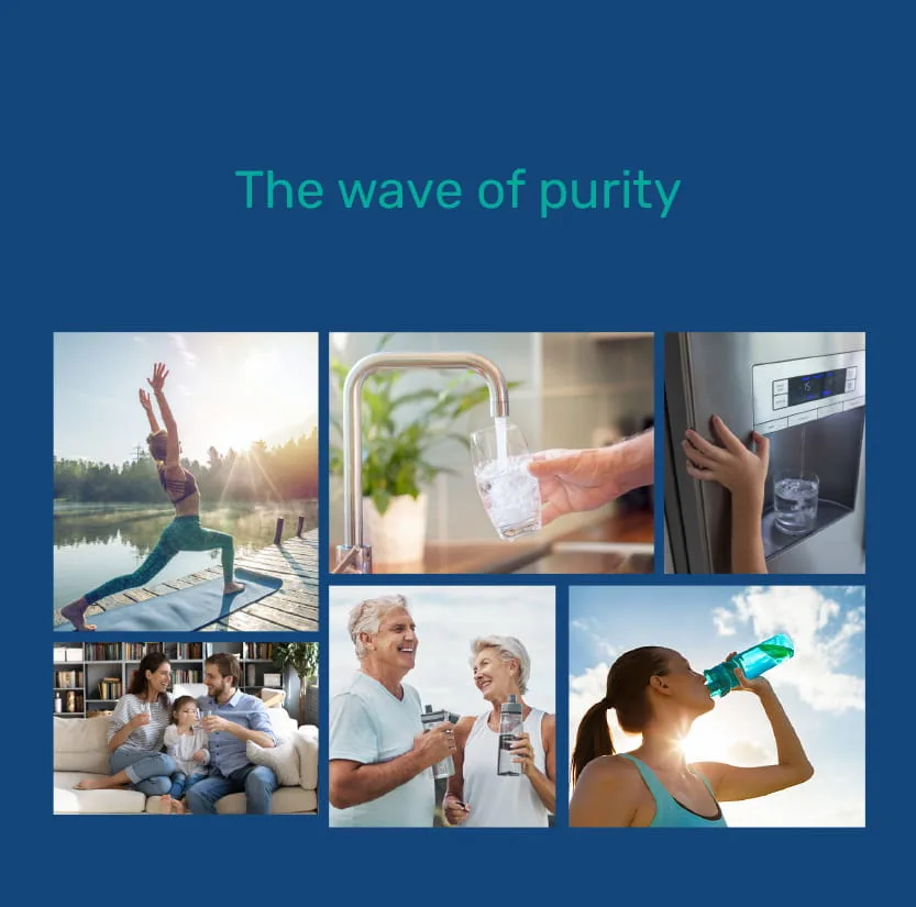
The Wave of Purity captures Bluvé’s central idea of clean, refreshing and wellness-focused hydration, bringing the name, wordmark and visual language together into one consistent brand identity.