About Project
A brand that started with ancestors and passed on to the passionate generation giving a new identity to the well-known industry handkerchief business.
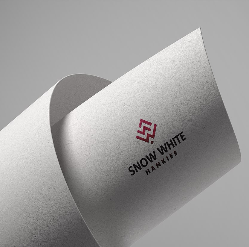
The logo design needed to represent the brand in a minimalist manner with its soul staying in tack with it.
- Client:
- Snow White Hankies
- Sector:
- Clothing & Accessories
- Service:
- Visual Identity


The Brief
A business coming from roots of heritage wanted to reshape the brand identity that associates with today’s generation and the world yet stay close to its history. The name identity is to be presented in a minimalistic approach with the initials representing it in a smooth color tone that is subtle.
Our Idea
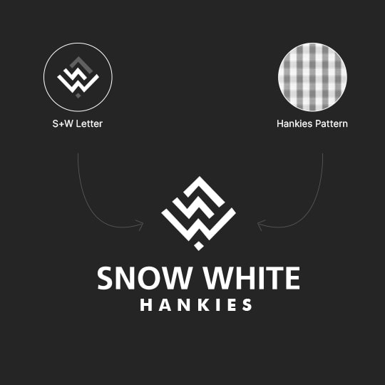
The company name denotes our two letters here 'S' and 'W' to represent the age-old name carried for a brand from ancestors. The S joins with an arrow that represents growth and scaling up as a brand. Hankies are essential accessory one carries in routine in their pocket, hence the shape places a part in connection to the pocket. The logo routes its way from the brand name to its usage of a piece of cloth that holds small yet important.

